Creating and Validating React Native Forms with Formik
October 16th, 2020 | By Aman Mittal | 11 min read

Tutorial to create and implement React Native Forms with Formik, a simple React/React Native form library to keep track of a form's state and handle submissions, among other things.
Forms are an essential part of a mobile app. Specifically, to handle user interactions that are available behind an authorization.
To ensure a seamless user experience, a form component consists of more than the input fields that allow users to enter their credentials. This can vary from handling form state, input field validation, handling errors, form submission, and so on.
Formik is an open-source React and React Native library that allows us to handle forms by:
Keeping track of the state of forms
Handling form submission via reusable methods and handlers (such as handleChange, handleBlur, and handleSubmit);
Handling validation and error messages out of the box.
Learn how to integrate it with Yup in a React Native app to create and validate forms.
Also, see how to change the focus of one input field to another using a device's keyboard by forwarding the ref created using a useRef hook.
The source code is available in this GitHub repository.
Prerequisites
To follow this tutorial, please make sure you are familiar with JavaScript/ES6 and meet the following requirements in your local development environment:
Node.js version >= 12.x.x installed
Have access to one package manager, such as npm, yarn or npx
The expo-cli version installed, or use npx
To learn more about how to set up and run the simulator or emulator in your local development environment, visit React Native’s official documentation.
Getting Started
Start creating a simple React Native app with a new screen: Login.js.
Create a new React Native project using Expo-cli. Then install the dependencies required to build this demo app. Open a terminal window and execute the following commands:
npx expo-cli init formik-example

cd formik-example

yarn add formik yup
Create reusable components
Create a new directory called components/. In this directory, we are going to keep two form components that are reusable for various types of forms, such as Login or SignUp.
Let's start by creating a simple form button component, which is a touchable element that allows the user to interact with the device’s screen and perform the next action. It is going to accept two props:
Label: the text label on the button component;
onPress, which is going to be handled by the parent component.
Create a new file called Button.js and add the following snippet:
import React from 'react';
import { TouchableOpacity, Text } from 'react-native';

export default function Button({ label, onPress }) {
  return (
    <TouchableOpacity
      style={{
        borderRadius: 8,
        height: 50,
        width: 245,
        justifyContent: 'center',
        alignItems: 'center',
        backgroundColor: '#e94832'
      }}
      activeOpacity={0.7}
      onPress={onPress}
    >
      <Text
        style={{ fontSize: 18, color: 'white', textTransform: 'uppercase' }}
      >
        {label}
      </Text>
    </TouchableOpacity>
  );
}
Now, let's create the second reusable component to let users enter their credentials. Create a new file called TextInput.js.
This component is going to be reused for every input field in a form. It is going to have an icon on the left of the input field to indicate the nature of the input field itself. It is also going to have placeholder text that tells the user what type of form value is expected.
It is going to accept one prop, and that is the name of the icon. Each input field may have a different icon and other props that are generally used with a TextInput component in a React Native app.
You will see what different props are used on a TextInput in the next section. For now, use a rest parameter syntax to pass down the ...otherProps.
import React from 'react';
import { TextInput as RNTextInput, View, StyleSheet } from 'react-native';
import { Entypo as Icon } from '@expo/vector-icons';

export default function TextInput({ icon, ...otherProps }) {
  const validationColor = '#223e4b';
  return (
    <View
      style={{
        flexDirection: 'row',
        alignItems: 'center',
        height: 48,
        borderRadius: 8,
        borderColor: validationColor,
        borderWidth: StyleSheet.hairlineWidth,
        padding: 8
      }}
    >
      <View style={{ padding: 8 }}>
        <Icon name={icon} color={validationColor} size={16} />
      </View>
      <View style={{ flex: 1 }}>
        <RNTextInput
          underlineColorAndroid='transparent'
          placeholderTextColor='rgba(34, 62, 75, 0.7)'
          {...otherProps}
        />
      </View>
    </View>
  );
}
Create a login screen
After setting up the reusable components, let's use them on a login screen. Start by creating a new directory called screens/, and then, inside it, create a new file called Login.js. This component file is going to consist of all the necessary elements and business logic behind a login form.
The first input field is going to be for an email. It is going to have properties such as:
the name of the icon as an icon.
autoCapitalize is going to be unique to this field since we do not want any characters to auto-capitalize by default.
autoCompleteType provides autocomplete hints from the device, so it can provide an autofill for the particular field. It has different types, but the one we are going to use here is for email.
keyboardType is set to email-address. It, too, has different types.
keyboardAppearance allows you to set the keyboard color either to the system's default or light or dark in the background.
returnKeyType and returnKeyLabel determine how the return key should look and the label on it. There are different values that you can set for it. Some of them are cross-platform, and some are OS-specific.
For the email input field, let's set it to “next” since we want the user to enter their email credential and then move on to the next input field by pressing the next button. To programmatically move on to the next input field, we are going to handle that later in a different section.
The second input field is going to be for passwords. It is going to use similar properties to the ones we used in the input field for email but with different values. It has a unique property such as secureTextEntry set to true, which is often used to enter text values that are sensitive, like a password.
Here is the code snippet for the Login component after creating these two input fields:
import React from 'react';
import { Text, View } from 'react-native';

import TextInput from '../components/TextInput';
import Button from '../components/Button';

export default function Login() {
  return (
    <View
      style={{
        flex: 1,
        backgroundColor: '#fff',
        alignItems: 'center',
        justifyContent: 'center'
      }}
    >
      <Text style={{ color: '#223e4b', fontSize: 20, marginBottom: 16 }}>
        Login
      </Text>
      <View style={{ paddingHorizontal: 32, marginBottom: 16, width: '100%' }}>
        <TextInput
          icon='mail'
          placeholder='Enter your email'
          autoCapitalize='none'
          autoCompleteType='email'
          keyboardType='email-address'
          keyboardAppearance='dark'
          returnKeyType='next'
          returnKeyLabel='next'
        />
      </View>
      <View style={{ paddingHorizontal: 32, marginBottom: 16, width: '100%' }}>
        <TextInput
          icon='key'
          placeholder='Enter your password'
          secureTextEntry
          autoCompleteType='password'
          autoCapitalize='none'
          keyboardAppearance='dark'
          returnKeyType='go'
          returnKeyLabel='go'
        />
      </View>
      <Button label='Login' onPress={() => true} />
    </View>
  );
}
To see the login form in action, run Expo Start or Yarn Start.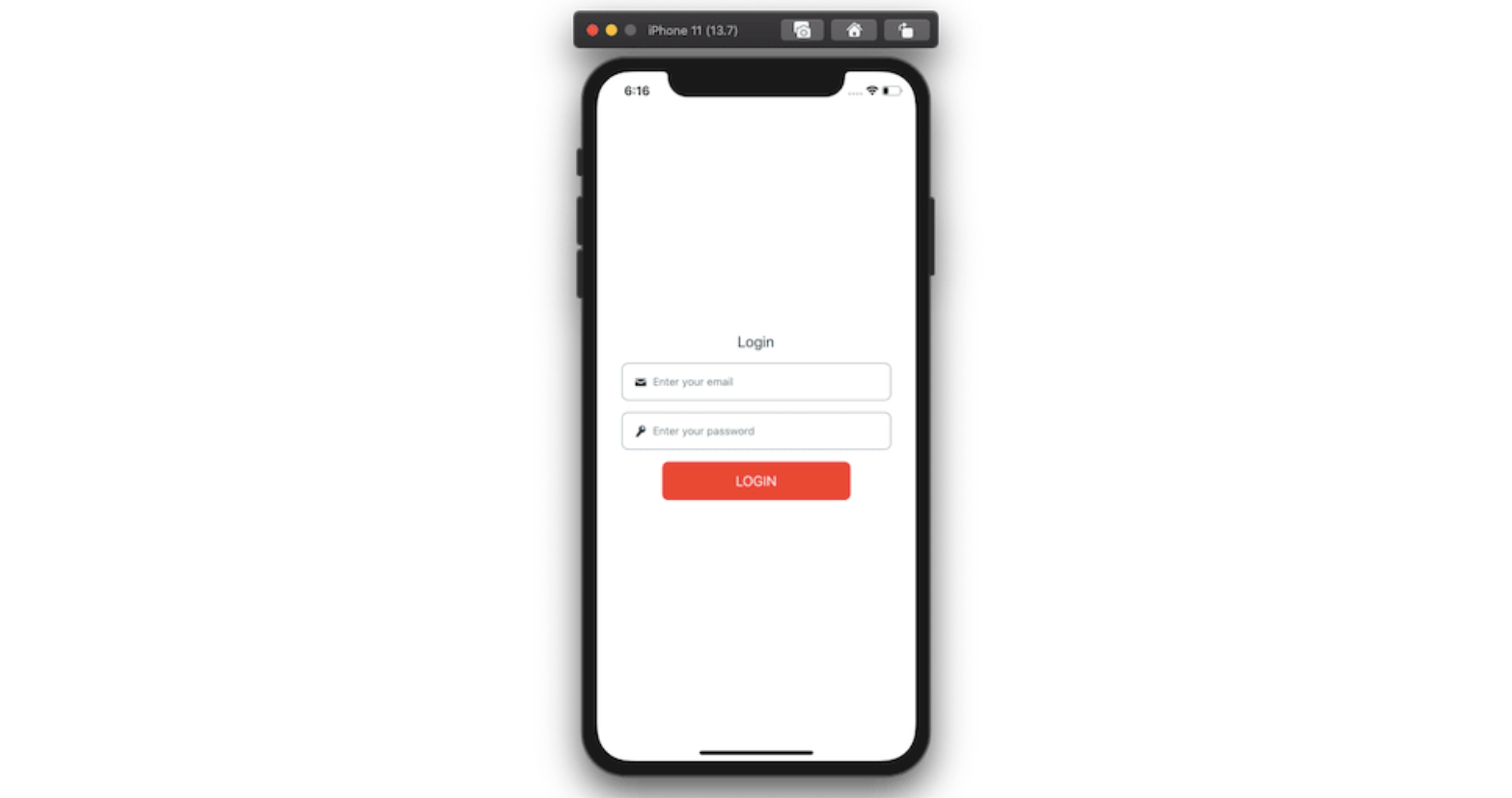
Add Formik to a login form using the useFormik hook
useFormik is a custom React hook that returns the Formik state and the handler methods to be used in a form component.
To use it, we have to import it from the Formik library in the Login.js file.
import { useFormik } from 'formik';
You might have noticed by now that we are not using useState to handle the value of each input field in the Login form. The reason behind that is that Formik comes with a property called initialValues, whose value is the object containing form fields.
In the case of the current form, these values are going to be email and password.
The onSubmit method accepts a function that has these values as the first argument to handle the form submission. We are going to use these values to verify if the user credentials provided in the demo app are correct.
You can also add other handler methods, such as navigating to another screen on successful form submission.
In the Login component, you can add the following:
const { handleChange, handleSubmit, values } = useFormik({
  initialValues: { email: '', password: '' },
  onSubmit: values =>
    alert(`Email: ${values.email}, Password: ${values.password}`)
});
Now, add onChangeText on both input fields as well as handleSubmit as the value of onPress on the Button component.
// on email input field
onChangeText={handleChange('email')}

// on password input field
onChangeText={handleChange('password')}

// change the value of onPress prop on <Button />
<Button label='Login' onPress={handleSubmit} />
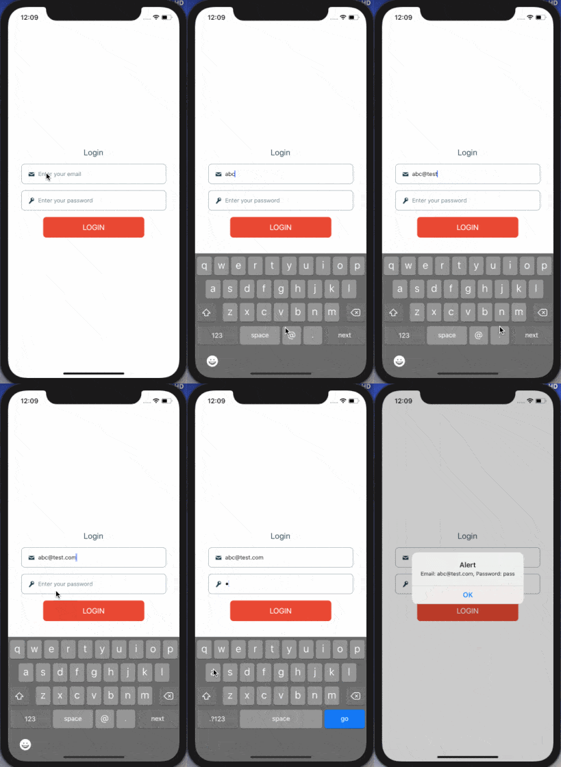
Fill in the input fields and press the login button to see an alert box returning these values.

This means the Login form with a custom component is working and Formik has been integrated successfully.
Add validation schema with Yup
The yup library is useful for managing complex validations when using Formik in either React or React Native apps. Formik supports both synchronous and asynchronous form validation. It has support for schema-based, form-level validation from Yup.
Start by importing it.
import * as Yup from 'yup';
Since initialValues is an object, you have to specify yup.object() and define the shape of the object. Make sure that, when you’re defining input fields inside the shape, their names correspond to those described in initialValues.
Each field in this object is supported by a chain of validation methods provided by the Yup API. The type of both email and password is going to be “string” since the onChangeText method returns the values as strings.
Add the following code snippet before the Login functional component:
const LoginSchema = Yup.object().shape({
  email: Yup.string().email('Invalid email').required('Required'),
  password: Yup.string()
    .min(2, 'Too Short!')
    .max(10, 'Too Long!')
    .required('Required')
});
Using a library like Yup for validation saves a lot of time, especially when you don’t have to define custom validation methods to check for an input field. For example, in the above snippet, using .email() automatically matches against a regex instead of defining one to check the validity of an email input field.
To validate input fields based on the schema just defined, let's add another property to useFormik called validationSchema.
const { handleChange, handleSubmit, values } = useFormik({
  validationSchema: LoginSchema,
  initialValues: { email: '', password: '' },
  onSubmit: values =>
    alert(`Email: ${values.email}, Password: ${values.password}`)
});
If you press the login button with blank input fields, the app won’t display an error, but it won't submit the form.
Validating input fields
If the user provides the wrong credential values (since we are not covering the backend API in this post, it is a good practice to check the validity of credentials on the server side as well), it's a good UX practice to indicate the error. In this section, let's turn the input field border and the left icon color to red if the defined validation schema object doesn't match.
We will be using errors, touched, and handleBlur to know whether the input field has been touched by the user and, if yes, will pass the prop errors to the custom TextInput to display UI changes based on that.
In the Login component, modify the following:
const {
  handleChange,
  handleSubmit,
  handleBlur,
  values,
  errors,
  touched
} = useFormik({
  validationSchema: LoginSchema,
  initialValues: { email: '', password: '' },
  onSubmit: values =>
    alert(`Email: ${values.email}, Password: ${values.password}`)
});
Then, for the email input field, add the following properties:
<TextInput
  // ... rest remains same
  onBlur={handleBlur('email')}
  error={errors.email}
  touched={touched.email}
/>
Similarly, modify the password field:
<TextInput
  // ... rest remains same
  onBlur={handleBlur('password')}
  error={errors.password}
  touched={touched.password}
/>
Now, go to the TextInput component, and pass new props: error and touched.
export default function TextInput({ icon, error, ...otherProps }) {...}
Next, let's change the value of validationColor, which we defined in a previous section, based on whether the input field is touched or not and if there is an error or not by using a nested ternary operator.
const validationColor = !touched ? '#223e4b' : error ? '#FF5A5F' : '#223e4b';
Now, go back to the simulator and, without entering the value for any input field, press the Login button. You will find that the border color and the icon color for both input fields turn red.
Try entering new values that satisfy the loginSchema. Also, see what happens if you touch one input field and move on to the next without entering any value. It will be considered touched, and an error will be shown.
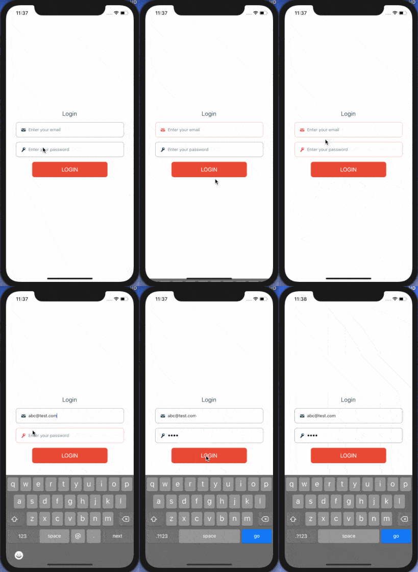
Try to enter a password with more than 10 characters and verify that an error is also shown.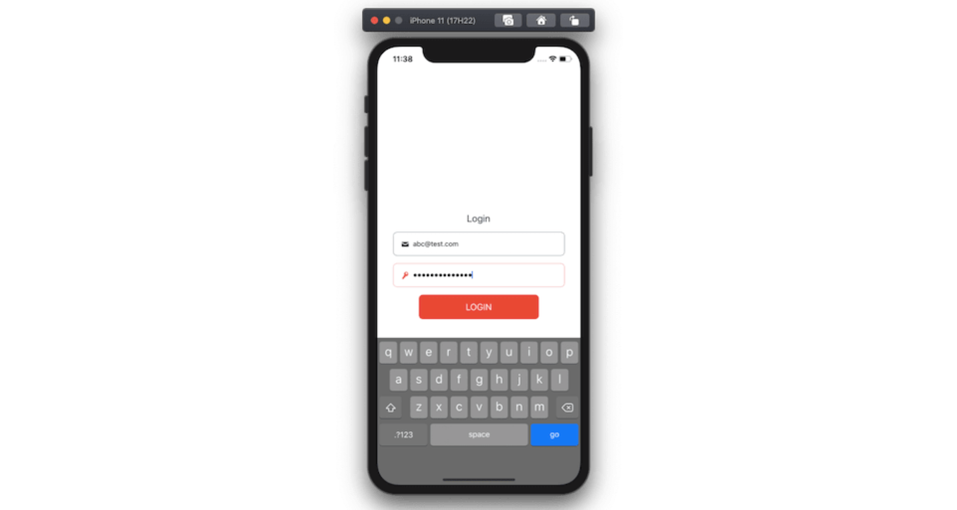
Select the next text input after pressing the "next" button
The last thing we need to do is add another property to each input field to select the next TextInput field when pressing the next button.
Since there are only two input fields, the next button is shown only in the email input field. This can be done by adding a property onSubmitEditing to the input field that accepts a callback as a value.
By creating a new reference for the password field, we can determine whether the input field in focus at any given time is the password or not. If not, that means it is the email field, and we can press the next button to change the focus from the email to the password field.
In the Login.js file, start by importing the useRef hook from the React library and, inside the Login component, define the ref with the initial value of null.
import React, { useRef } from 'react';

//...

export default function Login() {
  const password = useRef(null);
  // ...
}
Next, add the ref property to the password input field.
<TextInput
  ref={password}
  // ...
/>
Then, add onSubmitEditing to the email input field.
onSubmitEditing={() => password.current?.focus()}
Back in the simulator, you will encounter the following warning: 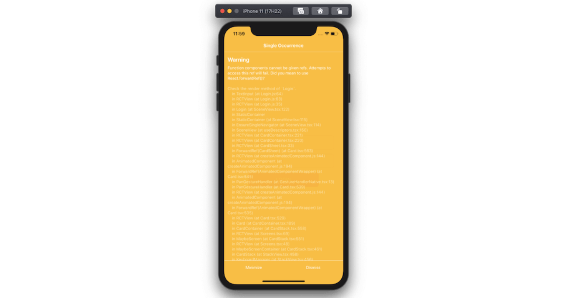
This can be solved by using a forwardRef on the custom TextInput component. Ref forwarding is a technique for automatically passing a ref through a component to one of its children. In our case, we need to pass the ref from Login to the TextInput component.
Open TextInput.js and import forwardRef from the React library.
import React, { forwardRef } from 'react';
Then, wrap all contents of the TextInput functional component with forwardRef, as shown below:
const TextInput = forwardRef(({ icon, error, touched, ...otherProps }, ref) => {
  const validationColor = !touched ? '#223e4b' : error ? '#FF5A5F' : '#223e4b';
  return (
    <View
      style={{
        flexDirection: 'row',
        alignItems: 'center',
        height: 48,
        borderRadius: 8,
        borderColor: validationColor,
        borderWidth: StyleSheet.hairlineWidth,
        padding: 8
      }}
    >
      <View style={{ padding: 8 }}>
        <Icon name={icon} color={validationColor} size={16} />
      </View>
      <View style={{ flex: 1 }}>
        <RNTextInput
          underlineColorAndroid='transparent'
          placeholderTextColor='rgba(34, 62, 75, 0.7)'
          ref={ref}
          {...otherProps}
        />
      </View>
    </View>
  );
});

export default TextInput;
Now, by pressing the “next” button on the email input field, you can change the focus of the current field to “password”.
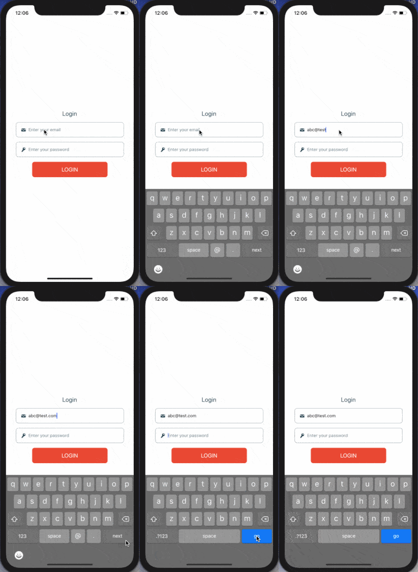
The password input field shows a go button, which indicates that, when users have finished entering their credentials, they are ready to submit the form. By adding onSubmitEditing with the value of handleSubmit, you submit the form.
Add the following to the password input field in Login.js:
onSubmitEditing={() => handleSubmit()}
And that’s it! Here is the output you are going to get after completing this step:
Conclusion
Using a form library like Formik gives us many advantages when building and handling forms to provide a pragmatic user experience.
There are many different methods available in the Yup API to add validation schema to a form component. This post covers the basics of Formik and Yup as well as one way of handling errors and touched fields.
In the last section, where we used ref to change the focus from one input field to the next, using a device's keyboard is not a must-have, but it may be worth considering if you want to provide a seamless user experience.
Finally, don't forget to pay special attention if you're developing commercial React Native apps that contain sensitive logic.
You can protect them against code theft, tampering, and reverse engineering.
Jscrambler
The leader in client-side Web security. With Jscrambler, JavaScript applications become self-defensive and capable of detecting and blocking client-side attacks like Magecart.
View All ArticlesMust read next
Securing React Native Applications
React Native is the framework of choice for cross-platform mobile development. Here, we explore several strategies to secure React Native applications.
August 12, 2022 | By Jscrambler | 18 min read
How to Animate a Header View on Scroll With React Native Animated
React Native Animated is a library that allows easily adding animations to React Native apps. In this tutorial, we use it to animate a header view.
October 1, 2020 | By Aman Mittal | 8 min read
Validations in Angular Reactive Forms
In this Angular tutorial, you'll learn how to add validations in Angular Reactive Forms.
June 2, 2021 | By Jay Raj | 8 min read
