Creating “Quarantine Pro” — A Fun Learning Experiment in React Native
May 14th, 2020 | By Aman Mittal | 14 min read

Creating Quarantine Pro is a fun experience for those feeling bored.
Learning Experiments in React Native COVID-19 has changed our way of life since the start of 2020. Self-isolating seems to be the best thing you can do right now. Thus, in isolation, we had a fun, simple React Native app idea.
The app is all about how long you have been quarantining. Input the date of the first day you started isolating, and the app displays a fun message to tell you how far you have come in the quarantine game.
Apart from being fun, this tutorial uses the latest SDK version 37.x.x. of Expo to build a demo app. You will learn the following three points:
How to use the Expo font hook
How to use a date time picker modal to select a date
Use Moment.js to convert the data input provided by the user
Here is a sneak peek of what we intend to build in this tutorial: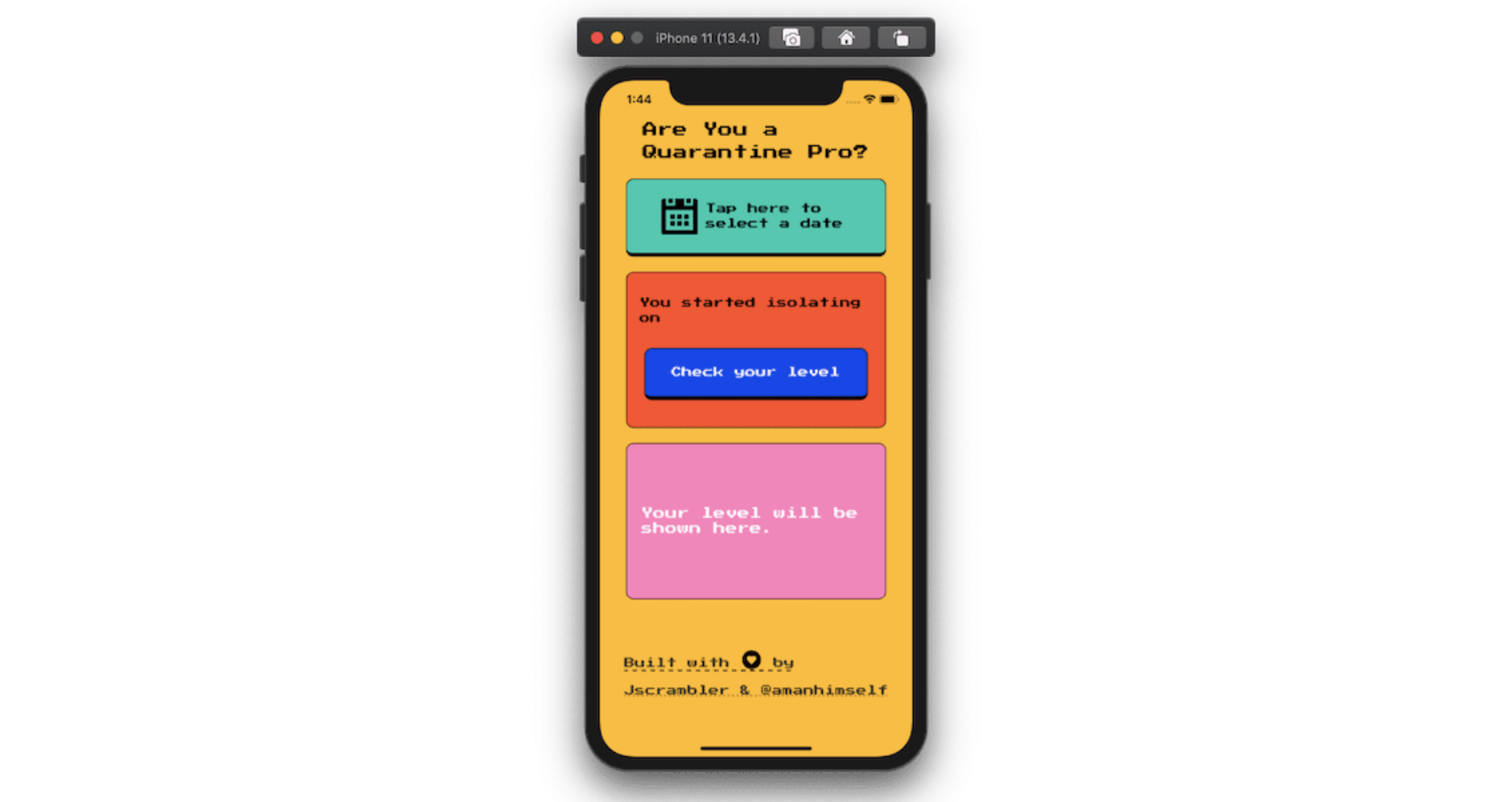
You can find the complete code for this tutorial in this GitHub repo.
Create a New Expo App
Start by creating a new Expo app at your favorite side-project location in your local development environment. Run the following command from a new terminal window to generate a React Native app using Expo-cli.
npx expo-cli init DaVinciOfIsolation
When asked to select a template, choose blank from a Managed workflow.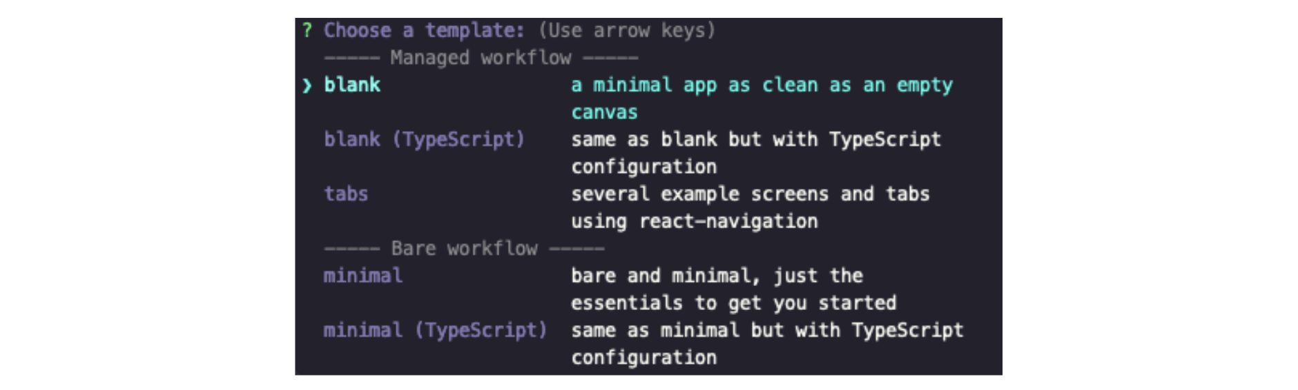
After that, press enter and let Expo-cli install the dependencies required to start this project.
Once the project has initialized generation, go to the project directory from the terminal window and start the Expo bundler service.
expo start
This will start the Expo app on a simulator or device where the Expo client is installed. For more information on installing an Expo client, visit the official documentation.
Once the app is running in the Expo client, the following default screen welcomes you: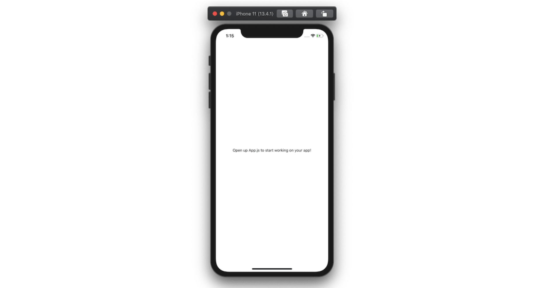
Let us install the npm dependencies we are going to need to build this project by executing the following command:
expo install expo-font @use-expo/font @react-native-community/datetimepicker
The Expo install adds dependencies using a specific version compatible with the Expo SDK.
Also, install the following npm packages either using npm install or using yarn:
yarn add react-native-modal-datetime-picker moment
With that, we have installed the required set of npm dependencies. Let us move further and start building the app.
How To Use Custom Fonts In An Expo App
Install a New Font
In this app, we are going to use a specific custom font that is free to download from Google Fonts (Press Start 2P).
To use this font or any other custom font, create a new directory called fonts inside the assets or folder. Then place the font file(s) you have just downloaded. The path to the fonts directory ./assets/fonts is a convention that Expo developers recommend using when placing custom fonts in your app.
After placing the file inside the newly created directory, the file structure will look like below: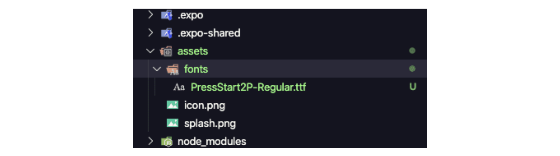
When you are downloading a font to use in an Expo React Native app, make sure you download either a font either.otf .otf or .ttf format. Those are the two formats that work across all Expo platforms, such as the web, iOS, and Android.
Use The useFonts Hook
To use any hook in a React or React Native app, you have to use functional components. To set up a new font, start by importing the following statements:
import React from 'react';
import { View, Text } from 'react-native';
import { useFonts } from '@use-expo/font';
import { AppLoading } from 'expo';
The useFonts hook takes one argument as a JavaScript object and returns a single item list containing a value telling you whether the font is loaded or not. This eliminates the need for a lot of boilerplate code to make this check.
After you have imported the statements, create a new object called customFont. It will have a key — the name of the font itself, and the value of this key, the path to the font file in assets/fonts/ directory.
const customFont = {
  'Press-Start2p': require('./assets/fonts/PressStart2P-Regular.ttf')
};
Next, inside the function component, define the isLoaded variable from the useFonts hook and pass the customFont object as its argument.
Also, when the font is in the loading state or has not loaded yet, it is a good practice to make use of the AppLoading component from Expo and render nothing on the screen.
Once the font has loaded, the screen will display the content of the functional component.
Here is the complete code for the App component. Right now, we are displaying the title of the app using the new font we have just installed.
export default function App() {
  const [isLoaded] = useFonts(customFont);

  if (!isLoaded) {
    return <AppLoading />;
  }

  return (
    <View
      style={{
        flex: 1,
        alignItems: 'center',
        backgroundColor: '#ffbd12'
      }}
    >
      <Text
        style={{
          fontFamily: 'Press-Start2p',
          fontSize: 24,
          marginTop: 80,
          paddingHorizontal: 20
        }}
      >
        {`Are You a Quarantine Pro?`}
      </Text>
    </View>
  );
}
From the above snippet, make sure you describe the fontFamily property on the Text component. This is the only way the font is going to be used for a specific text component.
Go back to the Expo client, and you are going to see the following result:
That's it! You have completed the first step of loading fonts and using them in a React Native app.
For more information, check out Cedric van Putten's collection of hooks that you can use in an Expo app.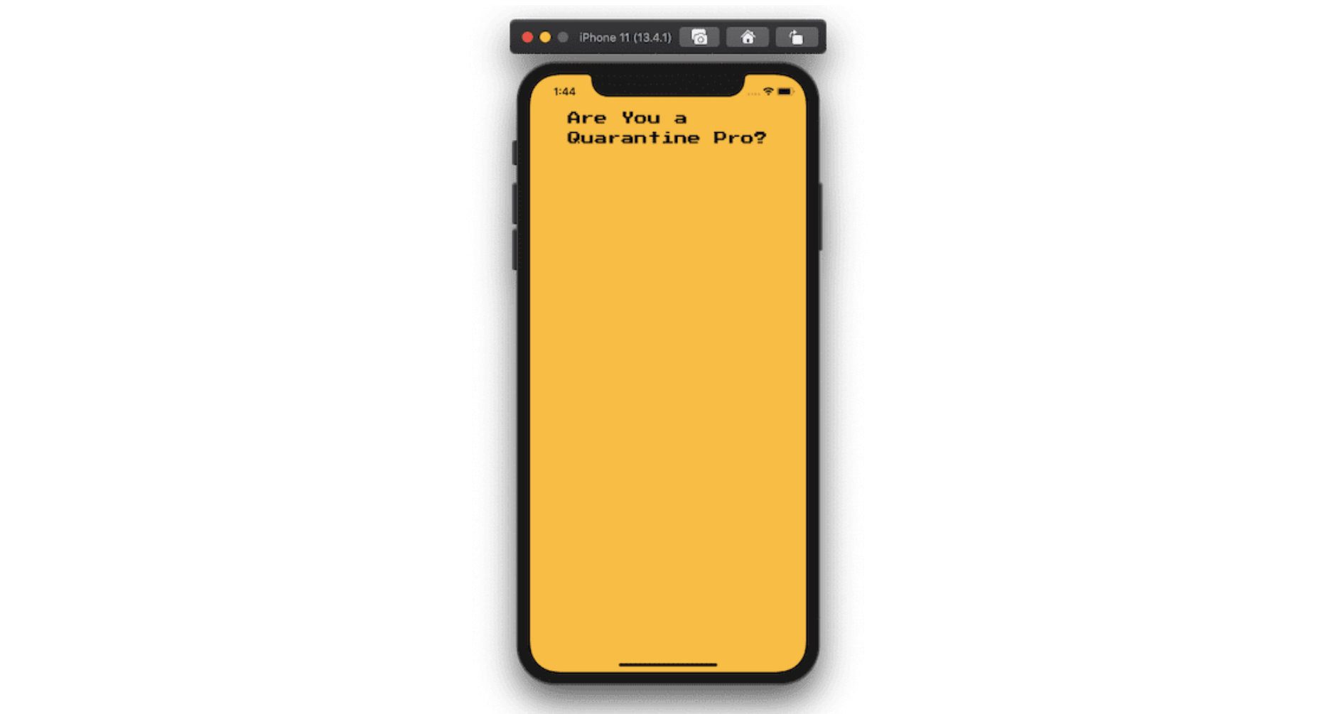
Create a Button To Use The Datetime Picker Modal
Since we have already installed the required npm dependencies to show a date picker modal (that uses the native date picker module), let us add a button to the current App.js file in order to display this modal.
Start by modifying the import statements as stated below and adding new ones.
import React, { useState } from 'react';
import {
  View,
  Text,
  StyleSheet,
  Dimensions,
  TouchableWithoutFeedback
} from 'react-native';
import {
  Fontisto,
  MaterialCommunityIcons,
  FontAwesome
} from '@expo/vector-icons';
import DateTimePickerModal from 'react-native-modal-datetime-picker';
To set the width and height of the button, we are going to use the Dimensions API from the react-native core. The width and height of the button are going to be calculated based on the width of the current window.
Define a variable W that is going to represent the width of the window before the App functional component.
const W = Dimensions.get('window').width;
Next, after the app's title text, define another container View component for the button. We are going to wrap the contents of the TouchableWithoutFeedback button inside a separate View component since this touchable component from React Native is only allowed to have a child component.
However, we are going to have two child components: the icon of the button and the text. Modify the return statement of the App component as per the code snippet below.
return (
  <View style={styles.container}>
    <Text style={styles.title}>{`Are You a Quarantine Pro?`}</Text>
    <TouchableWithoutFeedback>
      <View style={styles.pickerContainer}>
        <Fontisto style={styles.icon} name="calendar" size={48} />
        <Text style={styles.pickerText}>{`Tap here to\nselect a date`}</Text>
      </View>
    </TouchableWithoutFeedback>
  </View>
);
Add the following styles to the above code snippet: let's make use of the StyleSheet object to manage styles in the current component file.
const styles = StyleSheet.create({
  container: {
    flex: 1,
    alignItems: 'center',
    backgroundColor: '#ffbd12'
  },
  title: {
    fontFamily: 'Press-Start2p',
    fontSize: 24,
    marginTop: 80,
    paddingHorizontal: 20,
    lineHeight: 30
  },
  pickerContainer: {
    marginTop: 20,
    backgroundColor: '#00c6ae',
    width: W / 1.2,
    height: W / 4,
    borderRadius: 10,
    borderWidth: 1,
    borderColor: '#000',
    borderBottomWidth: 5,
    borderBottomColor: '#000',
    justifyContent: 'center',
    alignItems: 'center',
    flexDirection: 'row'
  },
  pickerText: {
    fontFamily: 'Press-Start2p',
    fontSize: 14,
    paddingHorizontal: 10,
    lineHeight: 20
  },
  icon: {
    color: '#000'
  }
});
Refresh the Expo client to get the following result: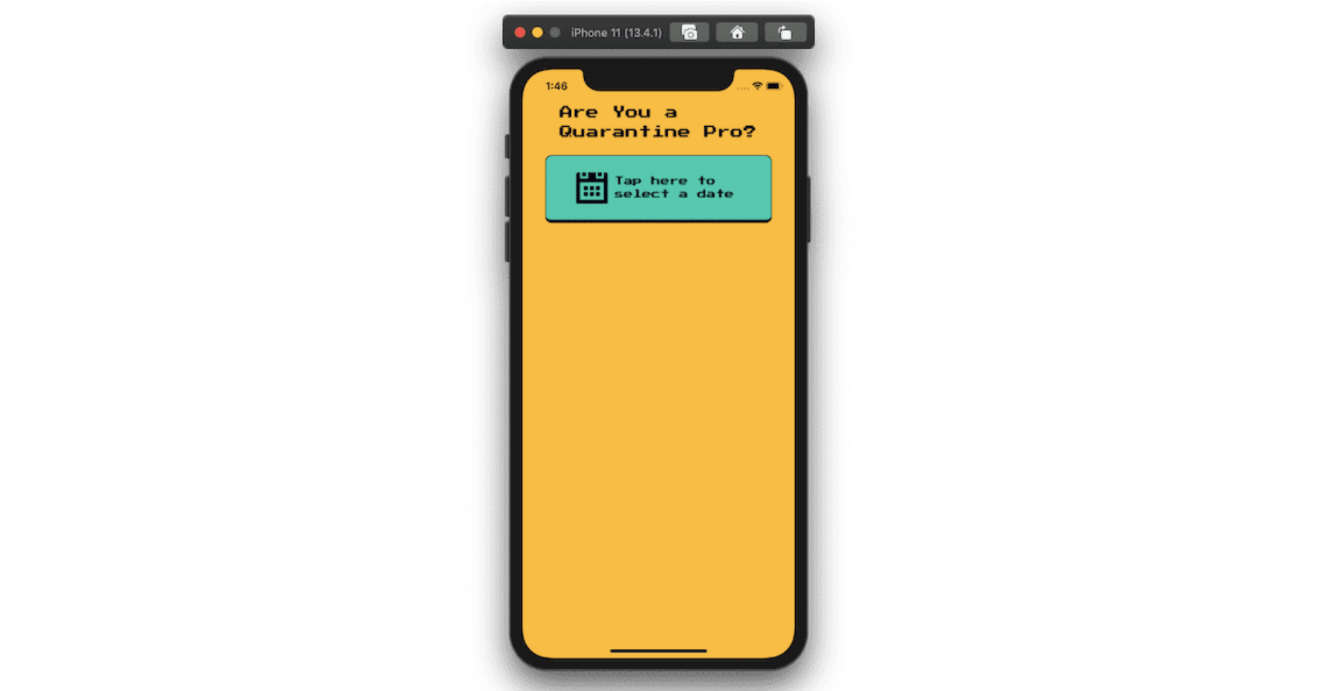
Now, let us bind the date picker modal to this button. We already imported the npm package react-native-modal-datetime-picker we need for this step.
We are using this library over the default @react-community/react-native-datetimepicker because this special library exposes a cross-platform interface for showing the native date-picker and time-picker inside a modal.
For our app, we are also going to evaluate the number of days the user has already spent in quarantine based on the date they choose as the input.
Let us define a few state variables using the useState hook from React for the following reasons:
pickedDate to store the date picked by the user;
isDatePickerVisible to show or hide the date picker modal.
We have to define three helper functions along with these state variables. The first two will handle the visibility of the date picker modal.
The third one will handle the confirm button from the date picker modal and decide what action to take when the user has to choose a date.
The action we have to take here is to hide the date picker modal as well as store the value of the date in the state variable pickedDate.
export default function App() {
  // ... rest of the component remains same

  const [pickedDate, setPickedDate] = useState(null);
  const [isDatePickerVisible, setDatePickerVisibility] = useState(false);

  function showDatePicker() {
    setDatePickerVisibility(true);
  }

  function hideDatePicker() {
    setDatePickerVisibility(false);
  }

  function handleConfirm(date) {
    console.log('A date has been picked: ', date);
    hideDatePicker();
    setPickedDate(date);
  }

  return (
    <View style={styles.container}>
      <Text style={styles.title}>{`Are You a Quarantine Pro?`}</Text>
      <TouchableWithoutFeedback onPress={showDatePicker}>
        <View style={styles.pickerContainer}>
          <Fontisto style={styles.icon} name="calendar" size={48} />
          <Text style={styles.pickerText}>{`Tap here to\nselect a date`}</Text>
        </View>
      </TouchableWithoutFeedback>
      <DateTimePickerModal
        isVisible={isDatePickerVisible}
        mode="date",.
        onConfirm={handleConfirm}
        onCancel={hideDatePicker}
        headerTextIOS="When did you start isolating?"
      />
    </View>
}
The showDatePicker method is going to be triggered every time a user taps the button to display the picker modal. The component will only render on the device's screen when this method triggers.
When the user taps anywhere outside the modal or taps on the Cancel button, the modal is hidden again and nothing happens.
However, when a date is selected and the user taps Confirm, further actions can be taken. Let us show the date picked by the user in a console statement.
The output is shown on the Expo server that is running in the terminal window. This means that the user input is now stored in the state variable pickedDate.
Also, you can apply other props available in @react-community/react-native-datetimepicker. In the date picker modal we are implementing, there is a small customization using the prop headerTextIOS. This prop allows changing the title of the picker modal for iOS devices.
Evaluate The “Quarantine Score”
The second missing piece of the puzzle in our current app is a button to calculate the day(s) difference between the user's input and the current date (we will use this as our “quarantine score”).
We are going to follow the same strategy design-wise as in the previous section. Display a button that users can tap to see their score.
Start by importing the Moment library in the App.js file after the rest of the import statements. It is going to handle the calculation between the user's input and the current date.
// rest of the import statements
import moment from 'moment';
This library is also going to help us format the input from the date picker modal and display only the date (and not time) from the user's input in the format YYYY-MM-DD.
Modify the return statement by adding a new View container that consists of a text message and a button to calculate the difference between the days.
Also, before modifying the return statement of the functional component, add a helper method called daysRemaining() that is going to calculate the difference.
We are going to store this difference in a state variable called days. This state variable is going to be used in the next section to display the correct result on the screen.
The difference is going to be calculated between the pickedDate (which is the user's input) and the todaysDate (which is the current date).
export default function App() {
const [days, setDays] = useState('');

function daysRemaining() {
  // user's input
    let eventdate = moment(pickedDate);
    // getting current date
    let todaysdate = moment();
    let remainingDays = todaysdate.diff(eventdate, 'days');
    setDays(remainingDays);
    return remainingDays;
  }

  return (
    <View style={styles.container}>
      <Text style={styles.title}>{`Are You a Quarantine Pro?`}</Text>
      <TouchableWithoutFeedback onPress={showDatePicker}>
        <View style={styles.pickerContainer}>
          <Fontisto style={styles.icon} name="calendar" size={48} />
          <Text style={styles.pickerText}>{`Tap here to\nselect a date`}</Text>
        </View>
      </TouchableWithoutFeedback>
      <DateTimePickerModal
        isVisible={isDatePickerVisible}
        mode="date"
        onConfirm={handleConfirm}
        onCancel={hideDatePicker}
        headerTextIOS="When did you start isolating?"
      />
      {/* ADD BELOW */}
      <View style={styles.showDateContainer}>
        <Text style={styles.showDateText}>
          You started isolating on{' '}
          {pickedDate && (
            <Text style={styles.showDateText}>
              {moment(pickedDate).format('YYYY-MM-DD')}.
            </Text>
          )}
        </Text>
        <TouchableWithoutFeedback onPress={daysRemaining}>
          <View style={styles.evaluateButtonContainer}>
            <Text style={styles.evaluateButtonText}>Check your level</Text>
          </View>
        </TouchableWithoutFeedback>
      </View>
    </View>
}
The picked date is displayed in the desired format using moment().format() functions. The pickedDate will only show once the user has provided input by selecting the date from the date picker modal.
Here are the corresponding styles for the above snippet:
const styles = StyleSheet.create({
  // rest of the styles remain same
  showDateContainer: {
    marginTop: 20,
    backgroundColor: '#F95A2C',
    width: W / 1.2,
    height: W / 2,
    borderRadius: 10,
    borderWidth: 1,
    borderColor: '#000',

    alignItems: 'center'
  },
  showDateText: {
    fontFamily: 'Press-Start2p',
    fontSize: 14,
    padding: 10,
    marginTop: 20,
    lineHeight: 20
  },
  evaluateButtonContainer: {
    marginTop: 20,
    backgroundColor: '#1947E5',
    width: W / 1.4,
    height: W / 6,
    borderRadius: 10,
    borderWidth: 1,
    borderColor: '#000',
    borderBottomWidth: 5,
    borderBottomColor: '#000',
    justifyContent: 'center',
    alignItems: 'center',
    flexDirection: 'row'
  },
  evaluateButtonText: {
    color: '#fff',
    fontFamily: 'Press-Start2p',
    fontSize: 14,
    paddingHorizontal: 10,
    lineHeight: 20
  },
}
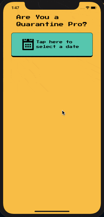
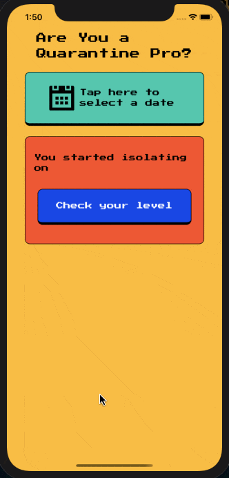
Select the date from the picker modal. After the date has been picked, it will be shown below:
Rendering The “Quarantine Level”
The last piece of this current app is to display the result when the user presses the button that says Check your level.
Modify the return statement of the App component. When the result is available, we are going to show the user's quarantine level, but when it’s not available, this UI box will display a default message. Just after the previous section's snippet, add another View container component.
When the evaluation is done, renderAchievements() is going to return only the icon and the text message based on the score (the difference between the current date and the user's input date).
Since we are using a state variable called days to store this difference, it becomes easy to conditionally render the message.
export default function App() {
// rest of the code remains the same

function renderAchievements() {
    if (days > 1 && days < 5) {
      return (
        <>
          <MaterialCommunityIcons
            name="guy-fawkes-mask"
            color="#000"
            size={54}
          />
          <Text style={styles.resultText}>
            Quarantine Noob. Don't forget to wear a mask. Keep self-isolating.
          </Text>
        </>
      );
    } else if (days >= 5 && days <= 7) {
      return (
        <>
          <MaterialCommunityIcons name="glass-wine" color="#000" size={54} />
          <Text style={styles.resultText}>Quarantine Connoisseur. Welcome to the (literal) dark side!</Text>
        </>
      );
    } else if (days >= 8 && days <= 15) {
      return (
        <>
          <MaterialCommunityIcons
            name="seat-legroom-reduced"
            color="#000"
            size={54}
          />
          <Text style={styles.resultText}>Quarantine Proficient. AKA “What is pants?”</Text>
        </>
      );
    } else if (days >= 16 && days <= 22) {
      return (
        <>
          <MaterialCommunityIcons
            name="star-circle-outline"
            color="#000"
            size={54}
          />
          <Text style={styles.resultText}>Quarantine Veteran. #StayHome became your life motto.</Text>
        </>
      );
    } else if (days >= 23) {
      return (
        <>
          <FontAwesome name="paint-brush" color="#000" size={54} />
          <Text style={styles.resultText}>THE ULTIMATE QUARANTINE PRO! You are part of the solution - thank you!</Text>
        </>
      );
    } else
      return (
        <Text style={styles.resultText}>Your level will be shown here.</Text>
      );
  }

  return (
    <View style={styles.container}>
      <Text style={styles.title}>{`Are You a Quarantine Pro?`}</Text>
      <TouchableWithoutFeedback onPress={showDatePicker}>
        <View style={styles.pickerContainer}>
          <Fontisto style={styles.icon} name="calendar" size={48} />
          <Text style={styles.pickerText}>{`Tap here to\nselect a date`}</Text>
        </View>
      </TouchableWithoutFeedback>
      <DateTimePickerModal
        isVisible={isDatePickerVisible}
        mode="date"
        onConfirm={handleConfirm}
        onCancel={hideDatePicker}
        headerTextIOS="When did you start isolating?"
      />
      <View style={styles.showDateContainer}>
        <Text style={styles.showDateText}>
          You started isolating on{' '}
          {pickedDate && (
            <Text style={styles.showDateText}>
              {moment(pickedDate).format('YYYY-MM-DD')}.
            </Text>
          )}
        </Text>
        <TouchableWithoutFeedback onPress={daysRemaining}>
          <View style={styles.evaluateButtonContainer}>
            <Text style={styles.evaluateButtonText}>Check your level</Text>
          </View>
        </TouchableWithoutFeedback>
      </View>

      {/* ADD BELOW */}

      <View style={styles.resultContainer}>{renderAchievements()}</View>
    </View>
}
Here are the styles for renderAchievements().
const styles = StyleSheet.create({
  // rest of the styles remain same
  resultContainer: {
    marginTop: 20,
    backgroundColor: '#FF89BB',
    width: W / 1.2,
    height: W / 2,
    borderRadius: 10,
    borderWidth: 1,
    borderColor: '#000',
    justifyContent: 'center',
    alignItems: 'center'
  },
  resultText: {
    color: '#fff',
    fontFamily: 'Press-Start2p',
    fontSize: 16,
    padding: 15,
    lineHeight: 20
  }
});
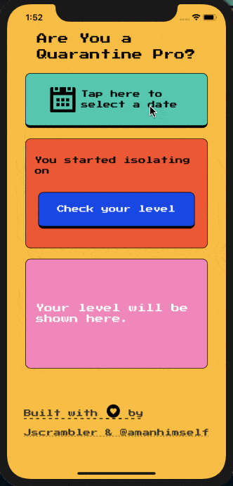
Now, go back to the Expo client, and you will be welcomed by our final app! Try to run the app and select different dates to see different results, as shown below.
Conclusion
We hope you had fun building this app and learning as well. The main objectives of this tutorial are now complete and summarized for better understanding below.
How to use the Expo font hook
How to use the DateTime picker modal to select a date
Use Moment.js to convert the date input provided by the user and calculate the difference between the current date (“quarantine score”).
Check out @react-native-community/datetimepicker for more information on how to customize the date picker modal or try to use a time picker. The Moment.js library is full of functions to help you manage dates and time in JavaScript apps.
The app is available at Expo. You just need to scan the QR code with the Expo client app on your device.
So, what kind of score did you get? Feel free to tweet us a screenshot @Jscrambler — we’re going to send a Jscrambler t-shirt to one lucky self-isolated dev!
Jscrambler
The leader in client-side Web security. With Jscrambler, JavaScript applications become self-defensive and capable of detecting and blocking client-side attacks like Magecart.
View All ArticlesMust read next
Add a Search Bar Using Hooks and FlatList in React Native
FlatList is a component of the React Native API that allows fetching and displaying large arrays of data. In this tutorial, we use it to add a search bar.
August 28, 2020 | By Aman Mittal | 8 min read
Securing React Native Applications
React Native is the framework of choice for cross-platform mobile development. Here, we explore several strategies to secure React Native applications.
August 12, 2022 | By Jscrambler | 18 min read
