Getting Started with Animations in NativeScript
April 11th, 2019 | By Wern Ancheta | 10 min read

In this tutorial, you will learn how to use animations in NativeScript to make your apps more dynamic and fun to use.
You can view the code on its GitHub repo.
Prerequisites
Basic knowledge of NativeScript is required to follow this tutorial. If you’re new to NativeScript, see our introductory tutorial about NativeScript.
On the software side of things, you need the following:
NativeScript development environment: We will only be using NativeScript preview to run the app so you don’t need to have an Android or iOS development environment setup.
NativeScript app runner: To run apps without a full setup, you need to have the following apps installed on your device. Note that this is optional if you have the full NativeScript environment. You can simply run the app using the method you normally use.
NativeScript Playground: Used for scanning the QR code for deploying the app on your device.
NativeScript Preview: Used by NativeScript Playground to run the app on your device.
App Overview
The NativeScript docs cover animations in great detail.
To make this tutorial more practical, we’ll clone an existing NativeScript app from GitHub and add animations to it. That way, you know exactly which parts of your app’s UI you can animate and what kind of animations to apply to them when you build your next app.
Setting Up the App
Start by cloning the repo and switching to the starter branch:
git clone https://github.com/anchetaWern/NativeScriptAnimatedTodo
git checkout starter
The starter branch contains the same code as the original repo which we forked it from. The master branch contains the final code of this tutorial.
Running the App
At this point, we can now run the app. It’s better to run it before we make any changes so you can easily see the output of each code as we add them.
As mentioned earlier, we will be using NativeScript Preview to run the app:
tns preview
If you have a full NativeScript development environment setup, you can simply execute tns run Android or tns run iOS instead.
Executing the command above will show you the following output: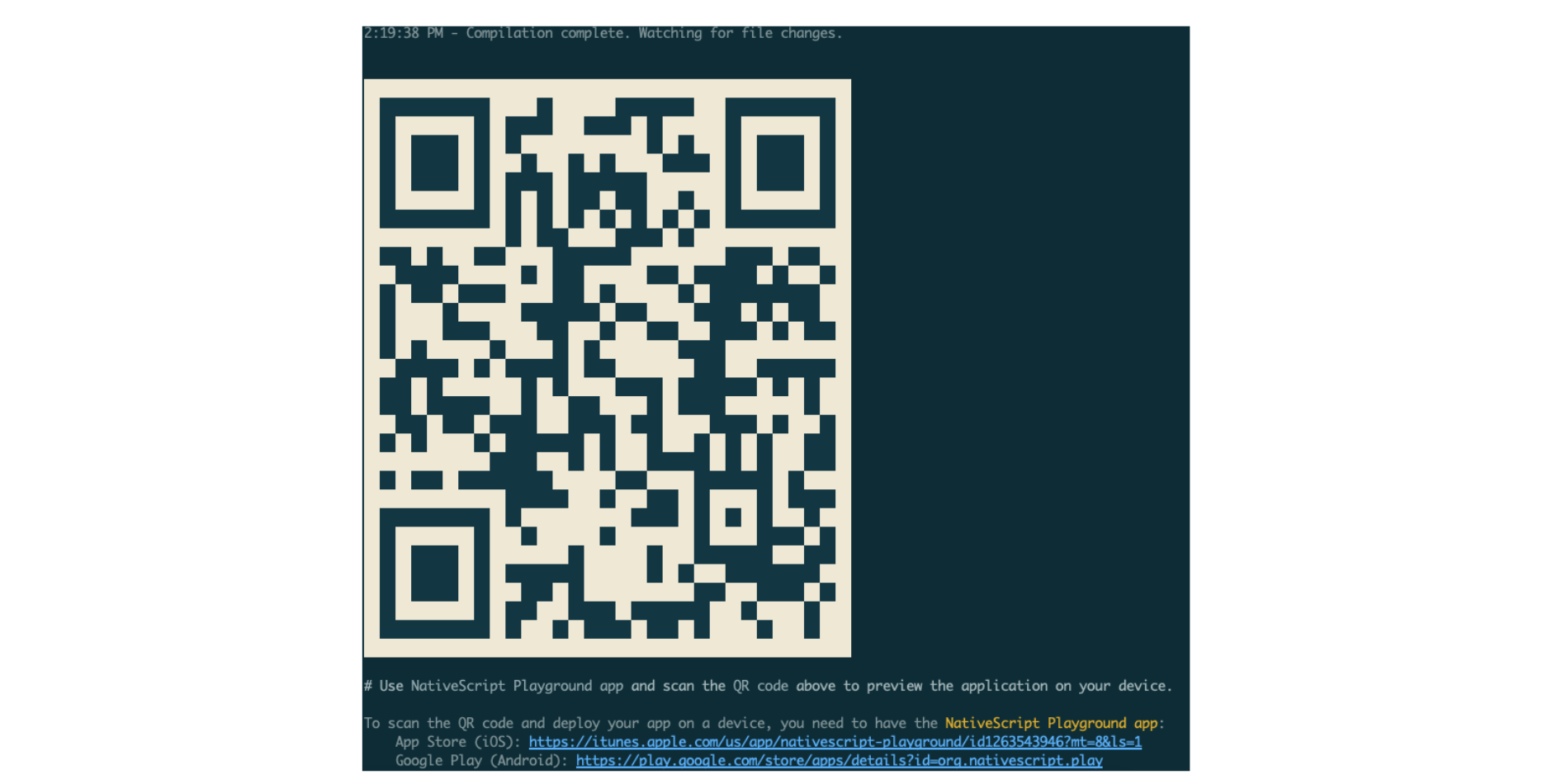 Simply scan the QR code with the NativeScript Playground app and it will automatically run the app on your device. Any changes you make will also trigger a refresh to the preview.
Adding the Animations
You don’t need to import animation modules separately in NativeScript, they’re baked right into the core of the framework itself so you can invoke them as you like. There are two types of animations in NativeScript:
Declarative
The NativeScript implementation of the CSS3 animations API. If you’re familiar with CSS animations, you should immediately know how to implement this type of animation.
Remember that not everything you can do with CSS animations in a browser environment can be done in NativeScript. This method is best suited for animating multiple views.Imperative
This is NativeScript’s JavaScript API for animating views. Unlike CSS animations, this gives you a more fine-grained control over how you execute animations. For example, you can chain different animations using this method. This method is best suited for animating a specific view.
Scale Animation
Now, we’re ready to add some code. Let’s order it from least to most complicated to implement. First, we want to make the button for removing a to-do item larger when a user presses it.
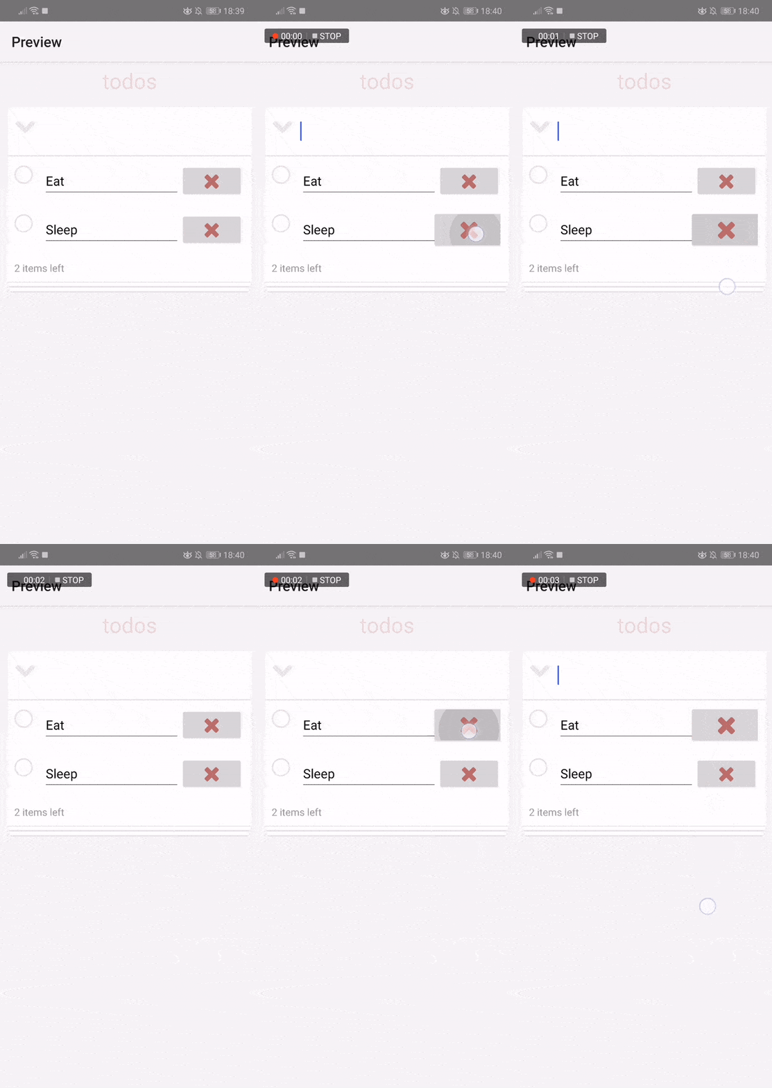
We know that there can be more than one of these buttons depending on the number of items in the todo. This makes our first choice to be declarative animations. Open the app/app.css file and add the following below the styles for the remove button:
.remove-button {
    color: #b76769;
}

// add this
.remove-button:pressed {
    transform: scale(1.2, 1.2);
}
The above code makes use of the pressed pseudo-class to only apply the specific styles when the remove button is currently pressed.
In this case, we’re using the transform property to scale the button to 200%. This works because you can actually see how it transitions from its pressed state to its normal state and vice-versa.
Combining Multiple Animations
Let’s take a look at how to implement animations using the imperative way. For this, we will animate the header label from small to big, from translucent to opaque, and we also move it from its original position:
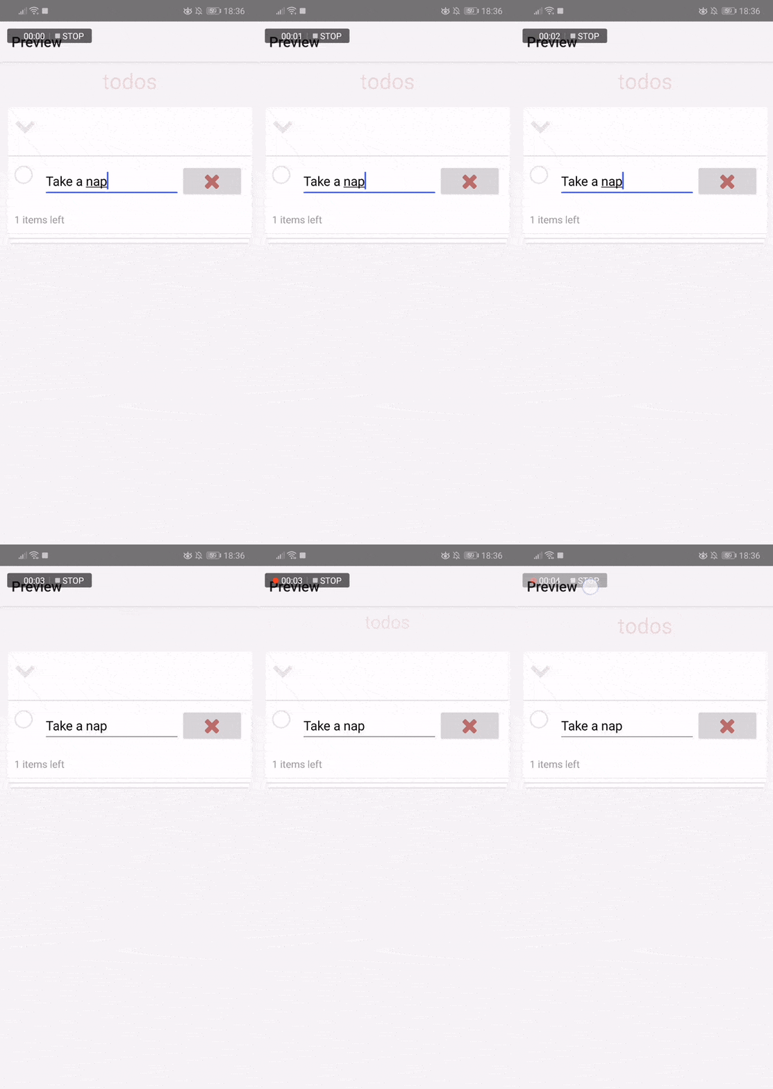
Open the app/main-page.xml file, and add an id attribute. We will use this to target this specific view from the JavaScript code:
<StackLayout class="main" stretch="fill">
    <Label text="todos" class="title" id="header" />
    ...
</StackLayout>
Open the app/main-page.ts file and, under the pageLoaded function, get the view using the id value you assigned to the label and execute the animation. This is immediately executed when the screen is rendered:
let pageLoaded = (args: EventData) => {
    let page = <Page>args.object;
    page.bindingContext = viewModel;

    // add these
    let message = page.getViewById("header");
    message.animate({
        translate: { x: 1, y: 20 },
        duration: 1000,
        scale: { x: 3, y: 3 },
        opacity: 1
    });
};
Breaking the code down, we first target the specific view we want to animate:
let message = page.getViewById("header");
From there, we can directly call the animate method from the view that it returns. Here, we’re performing three different animations (translate, scale, and opacity) at the same time over the course of one second:
message.animate({
    translate: { x: 0, y: 20 }, // translate the Y position by 20 pixels (top to bottom)
    scale: { x: 3, y: 3 }, // scale by 3 times its original size
    opacity: 1, // make the text more visible
    duration: 1000 // animate for 1 second
});
Both translate and scale require the x and y values. Even if you don’t want to animate a specific value, you have to specify it. In those cases, simply pass in 0 as the value. This will retain the original size or position of that view in that specific coordinate.
Lastly, so that there’s actually something to animate, we need to update the initial styles in the CSS file:
/* app/app.css */

.title {
    /* replace these: */
    font-size: 10;
    opacity: 0.2;
    margin-bottom: 50;

    /* add this: */
    top: -20;
}
Swipe Gesture
The next animation will be the “slide out” animation invoked by the swipe gesture. It will be an alternative method for a user to remove a todo item:
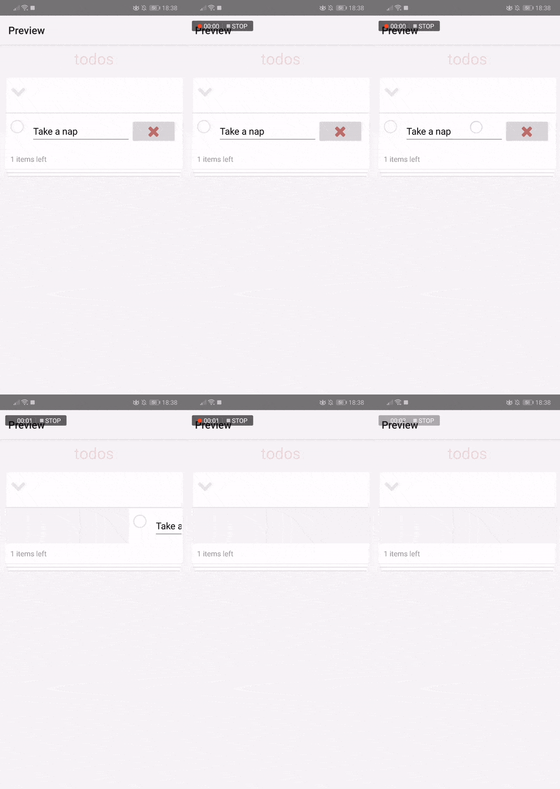
NativeScript comes with a set of gestures that you can use to execute specific functions when they are triggered by the user. One of these gestures is swipe.
Open the app/main-page.xml file and add it to the StackLayout which wraps the entire todo item:
<Repeater.itemTemplate>
    <StackLayout swipe="onSwipe">
        <GridLayout>
            ...
        </GridLayout>
    </StackLayout>
</Repeater.itemTemplate>
Next, open the app/main-page.ts file and add the onSwipe method. Inside, invoke the animation.
Once the animation is complete, we remove the item just like how it’s removed when the remove button is pressed:
let onSwipe = (args: GestureEventData) => {
    let item = < StackLayout > args.view;

    item.animate({
        translate: {
            x: 500,
            y: 0
        }, // move the todo item 500px to the right from its original position, y stays the same
        duration: 700
    }).then(() => {
        // animation is complete so remove the item
        var todo = < Todo > ( < view.View > args.object).bindingContext;
        viewModel.remove(todo);
    });
};
 Note: In the code above, we’re not actually checking which direction the user is swiping. Since this is not a game, and it’s normal to flick an item to the right if you want to remove it, the only thing that we care about is that we’re targeting a specific to-do item. That’s why we specifically attached it to the StackLayout. Feel free to use NativeScript’s Gesture Module if you want to limit it to a specific direction.
Custom animations for adding and removing todo items
The final animation that we’re going to implement is the “slide in” animation when a new todo item is added, and the “slide out” animation when multiple todo items are removed:
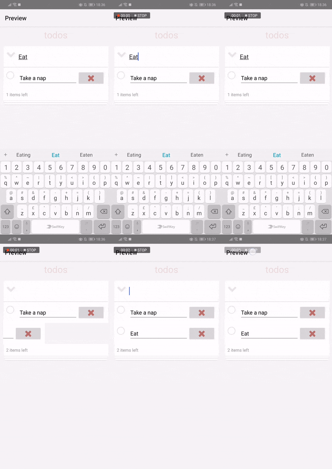
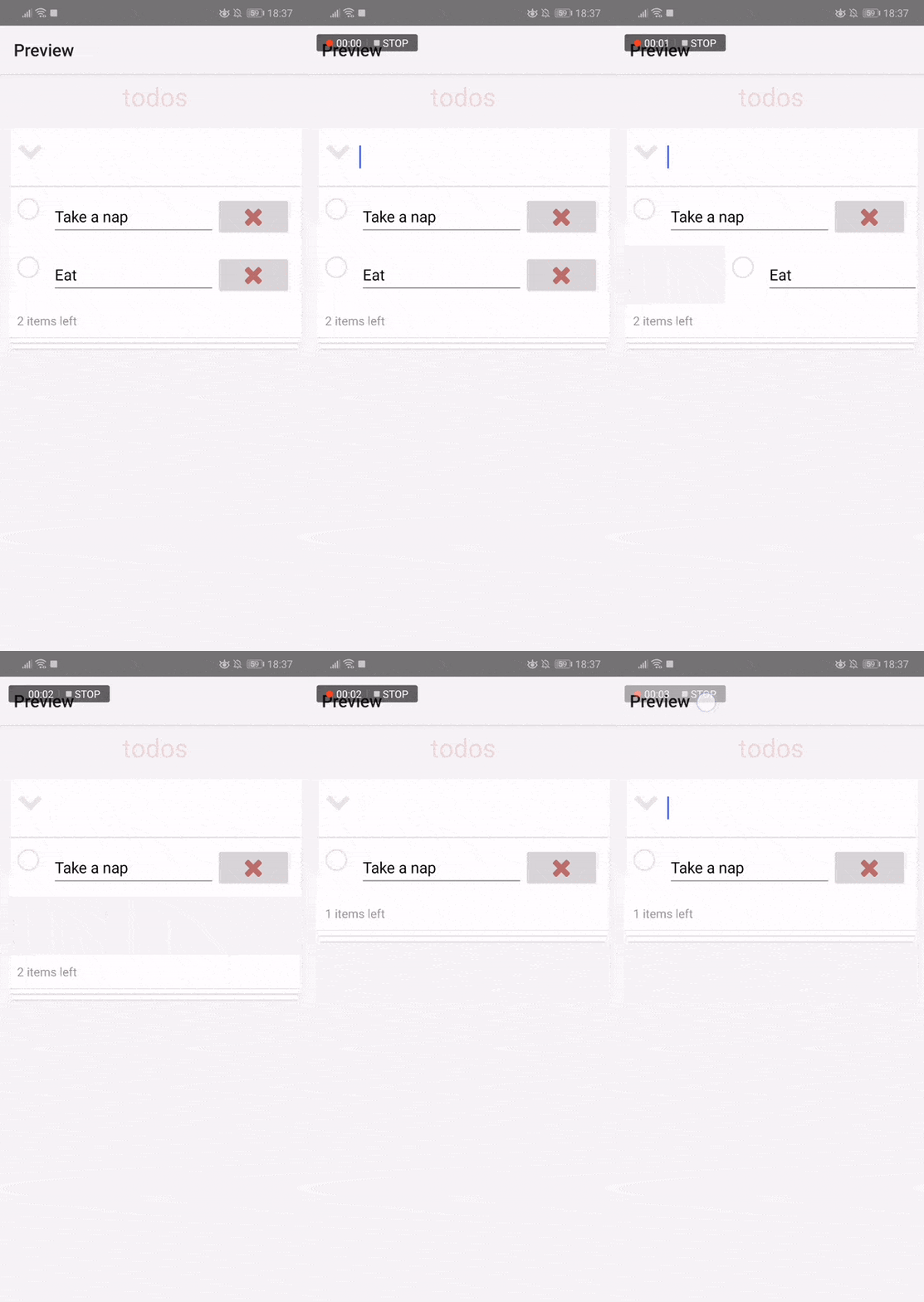
We will be using a translated animation for this. But unlike the translated animation we’ve done earlier, its implementation is a bit more complicated. This is because we have to update a lot of the existing JavaScript code in order to implement it properly.
Let’s first implement the animation when adding a new item.
Start by updating the template to use an AbsoluteLayout instead of StackLayout. This allows us to absolutely position the views inside of it. In this case, we want to hide a new item by default. is_new is a new property that we will add to each todo item. This will have a value of true if the item was just created, but we will update it to false as soon as the animation is completed.
We will use CSS animations to animate these new items so we’re also applying the is-new class if the item is newly added. This is the class where we will declare the animation:
// app/main-page.xml
<Repeater.itemTemplate>
    <AbsoluteLayout swipe="onSwipe">
        <GridLayout left="{{ is_new ? -300 : 0 }}" columns="30, *, auto" rows="auto"
            class="{{ is_new ? 'todo is-new' : 'todo' }}">
        </GridLayout>
    </AbsoluteLayout>
</Repeater.itemTemplate>
Next, add the animation. Unlike the very first animation in this tutorial, we’re now creating a custom animation which we named slide_in. It uses a transform animation, but now we have specified a from and to values. from is where you define the initial values for the animations you want to use.
In this case, we’re using transform animation which translates the X coordinate of the todo item from -300 to 300. This works with the left value of -300 because the user won’t see the todo item jerk from the default position (0) to being hidden (-300) then back to the default position again (0) since it’s already hidden from view:
/* app/app.css */

.is-new {
    animation-name: slide_in;
    animation-duration: 0.5;
    /* animate for half a second */
    animation-timing-function: ease-in;
    animation-fill-mode: forwards;
}

@keyframes slide_in {

    /* create a custom animation named slide_in */
    from {
        transform: translate(-300, 0);
    }

    to {
        transform: translate(300, 0);
    }
}
It can be simplified to just this code, but I wanted to show you how custom CSS animations are done in NativeScript:
.is-new {
    transform: translate(300, 0);
}
You might think it’s easy, but we’re not actually done yet. We still have to update the model to use the is_new field:
// app/view-models/todo-view-model.ts
class Todo extends Observable {
    text: string;
    completed: boolean=false;
    is_new: boolean=true; // add this
}

constructor(text: string,
completed: boolean=false,
is_new: boolean=true // add this

) {
    super();
    this.text=text;
    this.completed=completed;
    this.is_new=is_new; // add this
}
Since the default value for the is_new field is true, we need to set it to override it with false when we’re fetching the data from the local storage:
var value = localStorage.getItem(key);
var result = new Array < Todo > ();
if (value) {
    let rawTodos = < Array < Todo >> JSON.parse(value);
    rawTodos.forEach(todo => {
        result.push(new Todo(todo.text, todo.completed, false)); // update this: pass false as the 3rd argument
    });
    return result;
} else return [];
});
The final step is to add the code for setting the is_new property of the newly added todo item to false:
// app/main-page.ts
let add = (args: EventData) => {
    let todo = viewModel.add();
    setTimeout(() => {
        viewModel.makeOld(todo);
    }, 3000);
};
The add method in the view model doesn’t currently return the new todo instance, so we added the code for that:
   // app/view-models/todo-view-model.ts
   add() {
   if (this.newTodo.trim().length > 0) {
     let todo = new Todo(this.newTodo.trim()); // update this
     this.todos.push(todo);

     this.set("newTodo", "");
     return todo; // add this
   }
While you’re in this file, add the makeOld method as well:
filterCompleted = {
    // ...
}

makeOld(todo: Todo) {
    todo.set("is_new", false);
    this._update();
}
Let’s wrap this up by adding the code for the slide-out animation for items that are removed. For this, we simply add a new condition for using the class where we put the animation:
// app/main-page.xml
<GridLayout left="{{ is_new ? -300 : 0 }}" columns="30, *, auto" rows="auto" class="{{ is_new ? 'todo is-new' : (is_removed) ? 'todo is-removed' : 'todo' }}">
I’ll leave it to you to update the app/models/todo.ts file to include the is_removed property.
Next, update the CSS file to include the is-removed class. This time, we’re starting out at 0 which is the default X position and we end up 700 pixels to the right of the default X position. This effectively hides the todo item away from view (for mobile phones at least):
/* app/app.css */
.is-removed {
    animation-name: slide_out;
    animation-duration: 0.5;
    animation-timing-function: ease-in;
    animation-fill-mode: forwards;
}

@keyframes slide_out {
    from {
        transform: translate(0, 0);
    }

    to {
        transform: translate(700, 0);
    }
}
Next, update the remote code so that it sets the is_removed property to true before it actually removes the item:
// app/view-models/todo-view-model.ts
remove(todo: Todo) {
    todo.set("is_removed", true); // add this

    setTimeout(() => {
        // existing code
        var index = this.todos.indexOf(todo);
        this.todos.splice(index, 1);
        this._update();
    }, 700);
}
Do the same for when the button for deleting all completed todo items is pressed:
clearCompleted() {
    // add these:
    var completedTodos = this.todos.filter((todo: Todo) => {
        if (todo.completed == true) {
            todo.set("is_removed", true);
        }
    });

    setTimeout(() => {
        // existing code
        var activeTodos = this.todos.filter((todo: Todo) => {
            if (todo.completed == false) {
                return true;
            }
        });

        this.set("todos", activeTodos);
        this._update();
    }, 500);
}
Conclusion
In this tutorial, you learned how to use animations in NativeScript to improve the user experience. Specifically, we used a combination of both declarative (CSS Animations) and imperative (JavaScript) animations in the todo app.
Jscrambler
The leader in client-side Web security. With Jscrambler, JavaScript applications become self-defensive and capable of detecting and blocking client-side attacks like Magecart.
View All ArticlesMust read next
Vue Transitions and Animations
Transitions and animations help bring web apps to life. In this tutorial, we explore these concepts from within Vue and how you can implement them.
May 7, 2020 | By John Au-Yeung | 11 min read
How to Animate a Header View on Scroll With React Native Animated
React Native Animated is a library that allows easily adding animations to React Native apps. In this tutorial, we use it to animate a header view.
October 1, 2020 | By Aman Mittal | 8 min read
